In March I worked with ClassDojo on a set of illustrated frames for Instagram, in-app story announcements and more. The objective was to make the illustrations eye-catching, unique, and appropriate for different occasions while leaving enough room for text. "They can be abstract, funky, weird as long as they're monstery."
ClassDojo’s visual brand revolves around a tight cast of monsters. Something that's been talked about at ClassDojo is continuously expanding their monster universe. I decided to contribute by introducing monster plants.
I played off of the classic floral design frames while giving it a playful twist that fits easily into their monster universe.
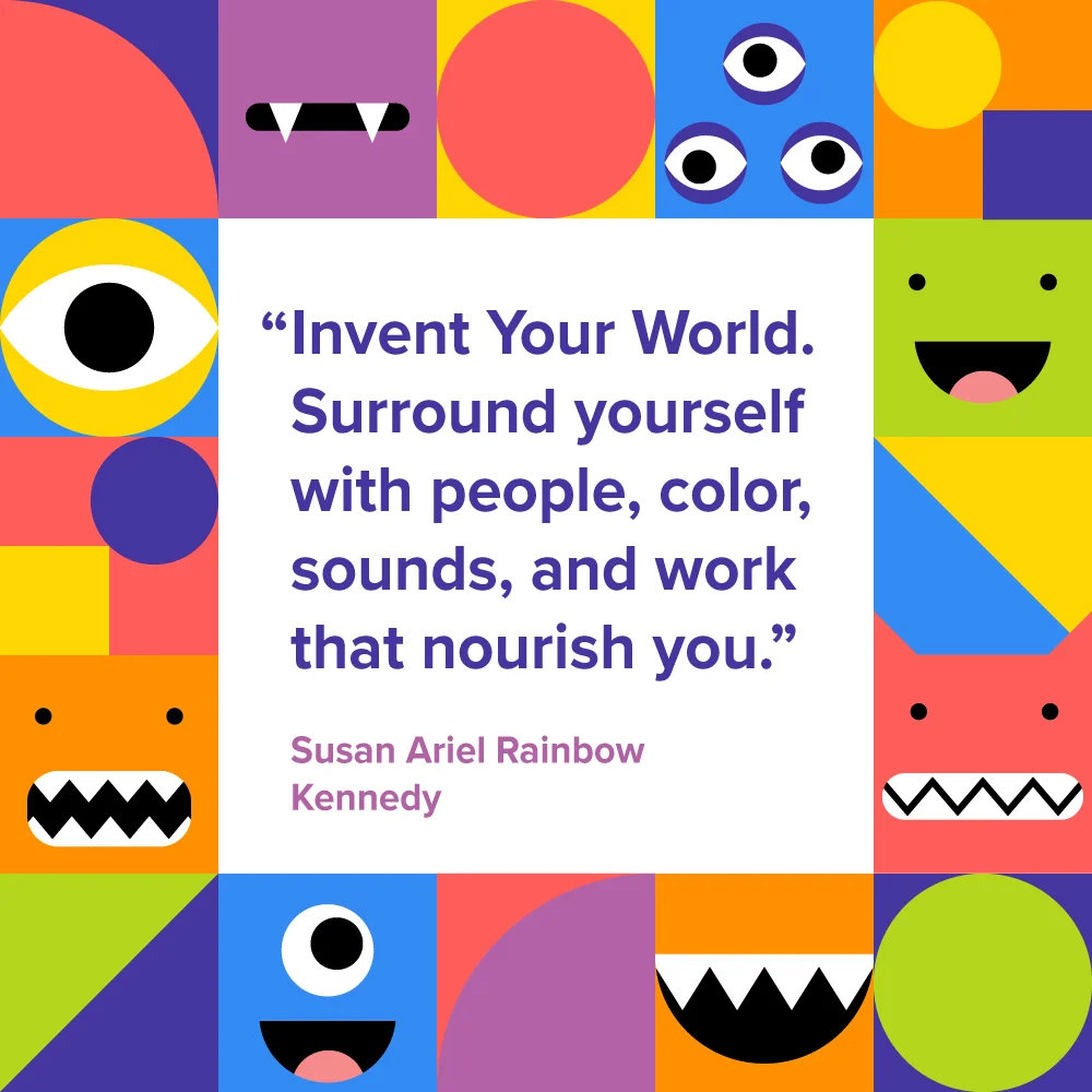
While continuing to thing about expanding ClassDojo’s monster universe, I tried to see how I could work with what they already haduniverse I broke down the individual parts of their existing monster characters into geometric shapes and pops of color. The gridlock design can be easily recolored, rearranged into a different aspect ratio, or turned into a fun pattern while still using memorable elements of their mascot and other characters.
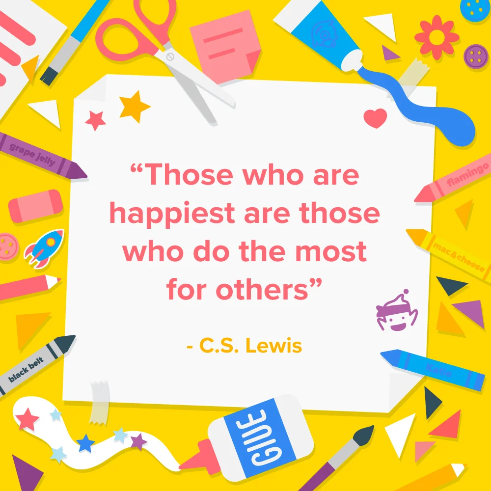
ClassDojo is a classroom tool used primarily in elementary school. This frame was created more classroom centered for fun project posts with some more subtle nods to their popular characters like Mojo and Katie.


